- Regular Price
- $ 19.99
- Sale Price
- $ 19.99
- Regular Price
- $ 19.99
Sold Out
- Unit Price
- per

Colors go beyond decorating or giving life to things, as these are essential elements to create any object depending on how they are used, whether to provide accents, harmony, interpretations, tendency to a space or object, they can improve our memory, capture our attention and even prompt us to make a decision. These can also transmit a message, an emotion or a brand identity, since colors represent an idea that is held in mind and is expressed visually.
Color is an interpretation, since the shape of an object contains pigments or dyes, which absorb or reflect light from a visible spectrum and is captured by the visual system.
This has temperature, saturation, intensity, brightness, hue, variants, theories and color systems. Below we will explain each one so that you can apply it later in any place, object, design.
Color theory are rules for mixing colors to achieve a necessary effect, light or pigments. These are based on the color wheel, a graphic wheel that shows in an orderly and two-dimensional way the colors that make it up, primary and secondary. Its function is to see different possibilities, put together and create effective and balanced designs.
The primary colors, magenta, cyan (blue), yellow are a triad of pure colors that do not rely on others to create them. Any color can be generated from these, they only have to be combined to obtain the desired result.
On the other hand, the secondary ones, orange, green and purple, are derived thanks to the mixture of the primary ones. Orange is the union of magenta and yellow, green is the fusion of cyan and yellow and finally purple is made from magenta and cyan. If you are looking to darken or lighten you can use black and white.

Within these standards there are different color schemes such as achromatic, monochromatic, analogous, complementary, triad and tetrad. Achromatic are the colors white, black and grayscale.

By monochromatic we mean the same color, but with different degrees of saturation and brightness.

Analogs are three colors that lie directly next to each other on the color wheel. For example yellow, orange and red.

Complementary colors are those colors that face each other on the color wheel and generate great contrast.
A tip that designers always use when they want to darken a color is precisely to use the complementary color. They obtain a result of a more grayish color, like pale pink.
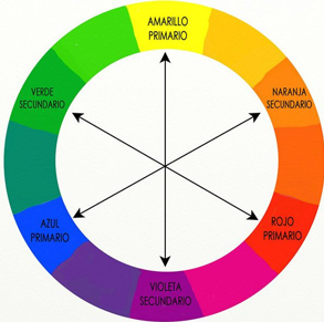
A Triad is made up of three colors separated by equal intervals on the color wheel.

And finally, tetrad, combinations made up of two pairs of complementary colors.

Whenever a color palette or collection is created, it is important to make color variants.
The color variant is the same design, only the color changes, but without them competing with each other. Furthermore, the variant must have the same saturation and intensity as the original color.

Low temperatures are warmer (yellow tints) such as red, orange, yellow or pink. These stimulate the nervous system, attract the person's attention and alter blood pressure. The highest ones are cooler (blue tints) such as blue, green, purple. In general, they are the ones that predominate, but without leaving aside the harmony or relaxation they provide.
Saturation is the intensity of a color that is expressed by the degree to which it differs from white, that is, how light, gray or dark the color is.

Brightness is the amount of light emitted by a light source or reflected by a surface, that is, it refers to the amount of light perceived and can be equally light or dark.

Finally we will talk about color systems. There are several such as HSB, LAB, PMS NCS, RGB AND CMYK. However, today we will talk about the most used in the industry.
RGB is the acronym in English for Red Green, Blue. It is the composition of color in terms of the intensity of the primary colors of light. It is precisely the one you use every day on your computer screen. So if your goal is to make a website or a post on the social network, we recommend using this system to create your designs.
CMYK has that name because of its acronyms, Cyan, Magenta, Yellow and Key (black). It is mainly used in color printing. Therefore, remember which system you are having your design printed on, as the color may be altered.
The PMS, Pantone Inc. is a company based in Carlstadt, New Jersey (United States), creator of the Pantone Matching System, an identification, comparison and communication system for the graphic arts and color.
Color is very important in textiles, since we generate something really striking thanks to color. We also make collections with color. These have:
With this information that you have seen, do you think you can achieve that touch of essence that your product needs?
Author | Jimena Chavez
"This information is for reference only, to obtain precise details about the use, qualities and care of our products, it is necessary to consult directly with your seller before making a purchase or receiving recommendations."
0 comments