According to the trend and news expert platform WGSN, color will play a very important role in creating attractive products and environments that instill a feeling of joy, optimism and well-being. The color palettes of 2024 will reflect innovation, consumer behavior, the future and the environment in which we live.  This year, the color palette is made up of earthy tones, an effect of connecting the earth and nature together with consumers, bright tones that highlight optimism, color contrast and fun, while soft neutrals will provide calm , relaxation and comfort. It will be a very balanced palette between cold and warm tones, timeless, bright, long-lasting and versatile. The main colors that will give character to the interior spaces this year are:
The cakes
These types of hues have particularly special commercial appeal, as they elevate style, provide lighting, enhance upholstery products and lend a light feel to heavy pieces such as shelves and sofas. The colors that will be in the greatest trend during 2024/2025 are purples, pale blues such as Cool matcha and Panna Cotta pink. 
Comforting greens
Aquatic greens and teal greens will elevate the decoration in certain objects or spaces, provide calm and tranquility and add brightness. In interior design, this color will be noticed in bathroom or kitchen spaces with some tiles or marble, in velvety textiles, and in ceramic or glass decorations. If different shades of green, i.e. light and dark, are mixed, they will add design, accent and interest to the place. 
Natural neutrals
To balance interior spaces, it is always necessary to have light and dark shades of neutrals, since light colors such as white, beige, creams, among others, provide a cozy feeling and refine the appearance of the decoration. On the other hand, dark tones create attractive dimensions on the surface and in the products and even obtain a vintage and elegant style. The main colors this season will be CHALK, OAT MILK, PUMICE, SUSTAINED GRAY, CHARCOAL and, of course, black could not be missing. 
bright roses
Using warm pinks this year will help enhance spaces and interior design. In addition, it will transmit well-being and optimism. The key color of the season will be Fondant Pink, a bluer tone that will modernize objects or environments in decoration, textiles and furniture. It can be noticed in decorations, chandeliers and kitchen utensils. An important point to mention is that warm pinks will become the new neutral colors, since it will be very easy to use in different materials and products. 
Earthy browns
The brown color has been considered timeless and enriching over time, since it makes items or spaces look sophisticated or enhance designs. Brown evokes warmth and tranquility, a nostalgic feeling, as it gives a retro touch to modern products. These tones will be found in tinted or smoked glass, ceramics, leather fabrics, woods, whites, furniture and upholstery to give discreet elegance. Above all, the main tones will be NUTSHELL and PERENNE DE SEPIA, since they connect with themes of authenticity, classicism and craftsmanship. 
deep plum
Dark purples will be very relevant colors, especially in winter, as they will highlight everyday elements in eye-catching pieces. They will give furniture and ornaments sophistication, luxury and a classic style. Especially eggplant or dark violet tones will highlight dining rooms, upholstery design, velvet and even bathroom spaces. 
Blues
There will be two ranges of blues that will stand out throughout the entire year. The first are blues with cold tones that will help rejuvenate home furniture and convey serenity. These are better known as nautical blues, they will be versatile and transseasonal, as they will give a great impact to furniture designs, lighting and decoration, since they will be elements that will modernize interior environments. Mainly, they will be found in upholstery, art, tableware and materials. 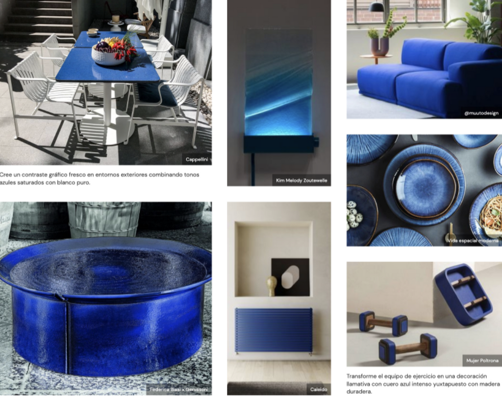
The second group will be elemental blue. This can be used for more refined spaces and slower lifestyles. Being a lighter tone, it will be used to set the mood as a neutral color, because unlike the one previously mentioned, this will not highlight an object, but will evoke warmth, a pleasant and combinable place thanks to its low saturation tint.
intense reds
These colors will be relevant to give eye-catching shine and add impact to smaller decorative objects as they will add color contrast anywhere. For many people it will be a dare. But they will encourage, give attention and fun to certain articles, as it is a stimulating and impactful tone. If you want to give an accent to a room or create a visual impact, this color is ideal for it. It will be very noticeable in finishes, materials, furniture, kitchen utensils, rugs, towels, decorative accessories and bedding. 
1 comment
Muchas gracias por este artículo. ¡Muy buena información!