- Regular Price
- $ 19.99
- Sale Price
- $ 19.99
- Regular Price
- $ 19.99
- Unit Price
- per

New year, fresh content!
In these months we will be adding updated or upcoming topics to the blog so that you always have at hand all the necessary data to be fashionable.
Starting a new year also means moving forward and looking into the trends and styles that are to come. Therefore, today we will tell you a little about the most popular colors that will be used this year.
Yes, we know that the color of the year was already announced previously, but we want to give you a wider and more varied range. Plus, you can combine these perfectly with the color of the year, Very Peri.
Many researchers say that some neutral and discreet tones will be left behind this year, since 2022 has arrived and it is time to express your own personality in the most fun and free way with brighter colors within your home.
Remember that the 5 colors that we will mention later will be the most likely to be used, only for trends in decoration and interior design, not for fashion and clothing.
It is an intense and energizing tone similar to fuchsia, which will stand out in both real and digital life, filling it with optimism. Likewise, it is ideal to combine with reds, blacks and even with the Very Peri color, since they not only share common characteristics, but also have warm tones. 

It is a color with less saturation and intensity, unlike others. But, it is quite versatile thanks to the warmth and vitality it brings to objects or places, especially outdoors.
We know that it is a color that not everyone may like, it can even scare you. However, it is an excellent option to create accents in certain spaces, it goes very well with pastel and bright colors.
Furthermore, if we take this color into consideration together with the Pantone 2022 mix, they make the perfect contrast, since they could be considered complementary colors and generate that ideal harmony.


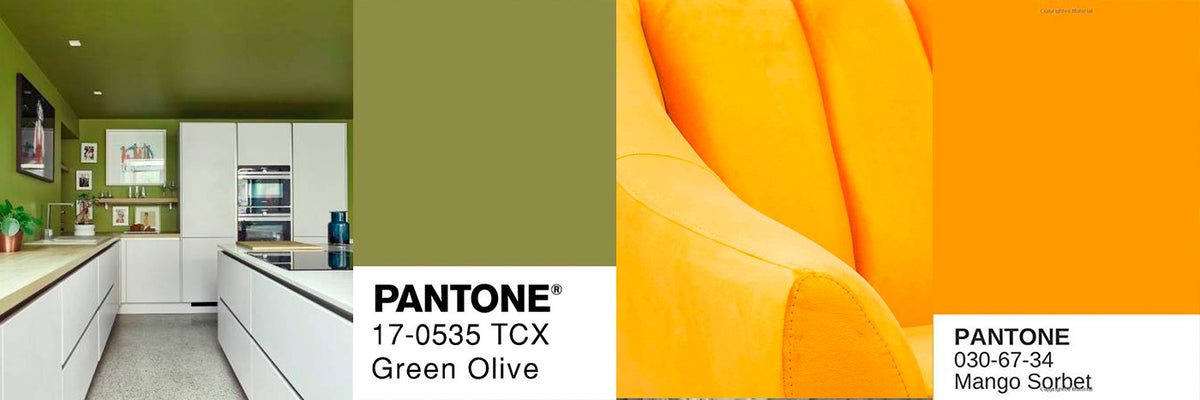
This is a deep color that is closer to yellows as opposed to other greens. Likewise, it is one of the most famous, used and well-known, because thanks to its great versatility and elegance it matches other green tones, grays, yellows and beige.


A classic tone that provides serenity and confidence. Its great versatility makes it fit not only on walls, but also on large and small objects.
If mixed with beige and white tones it transmits well-being and peace.


Finally we have this color mix of yellow and orange, which provides a fresh, energetic and vibrant touch to the decoration, motivating feelings of well-being, joy and optimism.
Precisely, this union of colors is another of the many qualities why you should add products with this color, since you will not only captivate the visual attention in a place, but like butter yellow, this could also be a complementary color with the Pantone of the year 2022 mentioned above.
Who doesn't want to use a color that transmits dynamism, contrast and strength when entering a space?


Are you ready to start the year full of vibrant and happy colors?
Don't wait any longer to create unique spaces with this new color palette!
Author | Jimena Chavez
"This information is for reference only, to obtain precise details about the use, qualities and care of our products, it is necessary to consult directly with your seller before making a purchase or receiving recommendations."
0 comments