- Regular Price
- $ 19.99
- Sale Price
- $ 19.99
- Regular Price
- $ 19.99
- Unit Price
- per

Illusion? Wait? Search? Intrigue?
Has this happened to you in the last few days to know the pantone for 2022?
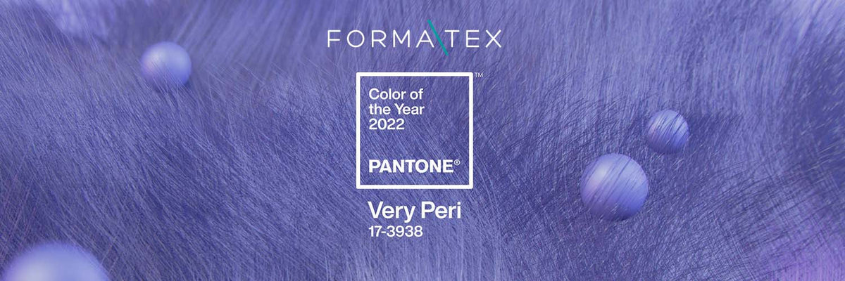
Probably yes, since many of us have been keeping an eye on social networks and the internet to find out what the trend that is to come will be. But the wait is over, the question we have all asked ourselves these weeks, what will be the color of the year, is already here and it is called Very Peri.

You may be wondering what that is, where the name comes from, why that color was chosen, what it means or represents. Don't worry anymore, you have come to the right place, because in this week's blog we will talk everything about this topic that has been so popular in recent hours.
Pantone, the company specialized in producing, managing and analyzing the latest trends in the field of color, on Wednesday introduced us to the Very Peri shade.
They define this color as one that expresses carefree confidence, hope and a bold curiosity that encourages our creative, inquisitive and intriguing spirit.
For them it was very important to create a color that represented the era of constant global transformation in which we live, since before, during and after the pandemic and the period of isolation, our physical, emotional and digital lives have changed and will continue to do so. However, they want this alteration to be lived with a grateful, renewed and, above all, visionary attitude.
With trends in gaming, the growing popularity of the metaverse and the growing artistic community in the digital space, this PANTONE illustrates the fusion of modern life and color trends in the digital world, which manifest in the physical world and vice versa.

Pantone 17-3938 'Very Peri' symbolizes the future and combines two main colors, the tranquility and dynamism of blue together with a bright, novel and energetic red. The objective of this is to encourage, encourage reinvention, brighten the mentality and behavior of society. Precisely this tone is one of the happiest and warmest among the blues.
Likewise, it is desired that the courage to create and imaginative expression be stimulated through dynamics.
But why are people so surprised this year?
One of the main reasons why it caused so much attention or impression on others is because for the first time the company invented a color instead of delving into its pre-existing archive, since for them it was of utmost importance to come up with a new color, because now they have a very new vision of the world, which was investigated through trends, deep analyzes and influences that they noticed in the last year.

Many consider it to be a versatile tone that can be applied in various industries such as fashion, interior design, furniture and even packaging. In addition, it can be adapted to various textures, materials and finishes.
Tell us in the option below if you agree with its versatility? What do you think of this color? Would you use it?
"This information is for reference only, to obtain precise details about the use, qualities and care of our products, it is necessary to consult directly with your seller before making a purchase or receiving recommendations."
0 comments