- Regular Price
- $ 19.99
- Sale Price
- $ 19.99
- Regular Price
- $ 19.99
Sold Out
- Unit Price
- per
Choosing a color can be a little difficult, especially playing with them and combining them can be complicated, since one never wants to fall into excessive or boring colors.
Hesitating about a range of colors is not wrong, on the contrary it is normal not to know which color choice is correct. Therefore, below, we will propose some ideas on how to combine colors in interior decoration so that you can get inspired.
As seen in some previous blogs, the color wheel is the source of visual information where it begins to combine. For this reason, it is important to take it into account and know it in order to generate a mixture of colors.
At the top are all the warm or cozy colors and at the bottom are the cold tones that transmit freshness and tranquility.
Now, you can play with opposite colors within it, such as red and green or purple and yellow. Be careful, to balance or lighten the weight of the two opposites, add whites or neutral colors to avoid excess visual communication.
Even if you are not looking for such a contrasting idea, you can incorporate one color and the two that are located on either side of its opposite, so that the opposition is not so extreme, for example violet, blue and yellow.
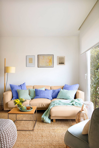
Illustration 1.
Another important detail is not to use two colors with the same importance, one should be the main one in the decoration and the other the secondary one.
Other neutral colors can be added to lighten the weight of the previous two. For example, you can use the large space to be the armchair or the wall to be with balanced and neutral colors and the details such as a cushion, furniture or sofa in bright colors.
Prints are also a great source to combine colors, either to give a contrast of textures, when you do not want to take excessive risks and are just looking for a touch of color or even using only one print you can base yourself on the colors it contains to mix other fabrics. with similar colors.

Illustration 2.
You can choose to use a single monochromatic color palette. Interior designers take one color as a base and apply it to walls, upholstery and fabrics, varying only its tone.
There are colors that are currently in trend such as black, green, gray or purple, but many times we do not know how to combine them or we are afraid to use them because we have a negative idea of them. However, later we will tell you some tips to know how to use them correctly.
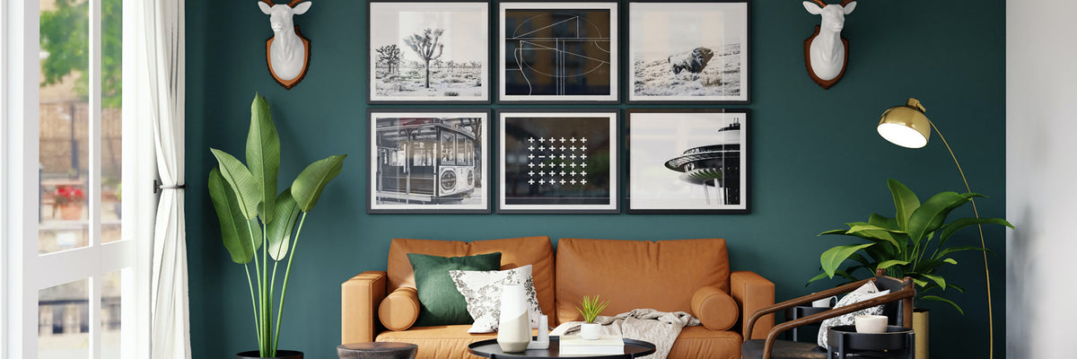
The color black , first we must get rid of the idea that it is too dark and second we must be moderate and not use this color, because thanks to it we can achieve an elegant and sophisticated space.
It is recommended to use it in bright spaces with soft tones, but if you do not dare to paint a wall in black you can continue using it as a complement.
The color purple , despite being a color that denotes sobriety and elegance, is often forgotten in decoration. Some colors it combines with are grey, pale pink and green. If you dare with something more striking and daring, you can try mustard yellow.
We inadvertently introduce the color green into interior decoration, but it is a color that combines very well with neutrals such as white or beige. Also, it can be used together with bright colors such as red or yellow.

Illustration 3 .
One of the most frequent doubts is how to combine colors in interior decoration with gray, a color that is very popular lately when it comes to decorating, especially because, like black and white, it combines with all colors, although there are some that go best with such as white, yellow, gold, blue, orange, earth tones with a yellowish undertone, etc.
Tell us how you thought about this information? Your opinion seems important to us.
Author | Jimena Chavez
"This information is for reference only, to obtain precise details about the use, qualities and care of our products, it is necessary to consult directly with your seller before making a purchase or receiving recommendations."
0 comments